
提示詞
GPT Image · UI 與圖形提示詞
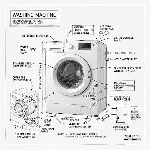
製作 的資訊圖像 將物件的真實照片或擬真渲染圖…|GPT Image 提示詞
這個提示詞可以生成什麼?
這個 GPT Image 提示詞可用來生成以「製作 的資訊圖像 將物件的真實照片或擬真渲染圖 與直接疊加其上的技術註記結合 使用純白攝影棚背景 以及黑墨線稿與文字 技術筆」為核心的 AI 圖片。頁面保留完整原文指令與生成參考圖,並整理來源、作者、日期和授權資訊,方便先重現畫面,再逐項修改主體、場景、光線、鏡位與視覺風格。
這個提示詞有哪些重點?
場景
- 使用純白攝影棚背景,以及黑墨線稿與文字(技術筆/建築草圖感),包含:主要零件標籤、內部剖面或爆炸圖輪廓、量測值、尺寸與比例標記、材質註記與數量、指示功能、受力或流向(空氣、聲音、電力、壓力)的箭頭,以及適用時的簡易示意圖或剖面圖
光線
- 視覺風格:極簡技術插畫美學,在寫實影像上覆以黑色線條,精準但略帶手繪感
鏡位與構圖
- 構圖乾淨,留白平衡
風格
- 風格與版面規則:真實物件在註記下方仍須清楚可見
這個提示詞要怎麼用?
- 1
先完整貼上目前顯示的提示詞;如內容提到參考圖片,請上傳臉部或主體清楚的原圖。
- 2
保留核心主體,再依需求調整場景、光線、鏡位、畫面比例與風格描述。
- 3
生成前確認來源與 CC BY 4.0 署名要求;商用時另行檢查肖像、品牌與素材權利。
這個提示詞的來源是什麼?
 1 / 4
1 / 4探索更多
更多相關內容
![Create a technical infographic of [OBJECT] with a 45-degree isometric 3D perspec](/api/storage/file?key=prompts%2F2017928823497453789%2F0.jpg) Create a technical infographic of [OBJECT] with a 45-degree isometric 3D perspective showing the device slightly tilted to reveal depth and dimension.
Combine a realistic photoreal render with black ink technical annotations on pure white background. Include:
Key component labels with color-coded callout boxes
Internal component visibility through transparent/cutaway sections
Measurements, dimensions, and precise scale markers
Material callouts and quantities
Color-coded arrows for function/flow: RED (power/battery), BLUE (data/connectivity), ORANGE (thermal/processor), GREEN (sensors/haptics)
Simple schematics or cross-sectional diagrams where relevant
Place “OBJECT” title in a hand-drawn technical box (top-left corner).
Style: Black linework (technical pen/architectural), sketched but precise. Object remains clearly visible. Educational museum-exhibit vibe. Clean composition, balanced negative space.
Perspective: Isometric 3D angle—tilted to show depth, dimension, and internal architecture dramatically. Like a professional product teardown or engineering manual.
Colors: ~10-15% accent density. Black dominant. White background.
Output: 1080×1080, ultra-crisp, social-feed optimized.
Create a technical infographic of [OBJECT] with a 45-degree isometric 3D perspective showing the device slightly tilted to reveal depth and dimension.
Combine a realistic photoreal render with black ink technical annotations on pure white background. Include:
Key component labels with color-coded callout boxes
Internal component visibility through transparent/cutaway sections
Measurements, dimensions, and precise scale markers
Material callouts and quantities
Color-coded arrows for function/flow: RED (power/battery), BLUE (data/connectivity), ORANGE (thermal/processor), GREEN (sensors/haptics)
Simple schematics or cross-sectional diagrams where relevant
Place “OBJECT” title in a hand-drawn technical box (top-left corner).
Style: Black linework (technical pen/architectural), sketched but precise. Object remains clearly visible. Educational museum-exhibit vibe. Clean composition, balanced negative space.
Perspective: Isometric 3D angle—tilted to show depth, dimension, and internal architecture dramatically. Like a professional product teardown or engineering manual.
Colors: ~10-15% accent density. Black dominant. White background.
Output: 1080×1080, ultra-crisp, social-feed optimized.![Create a typographic illustration shaped like a [OBJECT], where the text [BRAND](/api/storage/file?key=prompts%2F2005620980891480567%2F0.jpg) Create a typographic illustration shaped like a [OBJECT], where the text [BRAND SLOGAN] forms the shape — bold and playful lettering style that fills the entire silhouette — letters adapt fluidly to the curves and contours of the [OBJECT] — [COLOR DESCRIPTION] with [BACKGROUND COLOR] background that enhances the focus on the main shape — include [BRAND] logo positioned below the [OBJECT] — vector-style, clean, high resolution, 1080x1080 pixels, square format.
Create a typographic illustration shaped like a [OBJECT], where the text [BRAND SLOGAN] forms the shape — bold and playful lettering style that fills the entire silhouette — letters adapt fluidly to the curves and contours of the [OBJECT] — [COLOR DESCRIPTION] with [BACKGROUND COLOR] background that enhances the focus on the main shape — include [BRAND] logo positioned below the [OBJECT] — vector-style, clean, high resolution, 1080x1080 pixels, square format.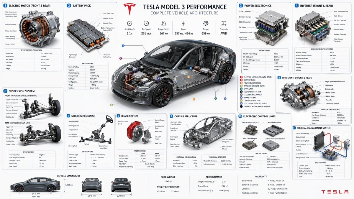 帮我生成 特斯拉 主要零部件 细节全图,周围 也加上 各模块细节图
![Create a branded technical infographic of a [SNACK], combining a realistic photo](/api/storage/file?key=prompts%2F2031795709243019280%2F0.jpg) Create a branded technical infographic of a [SNACK], combining a realistic photograph or photoreal render of the product with technical annotation overlays placed directly on top. Use black ink–style line drawings with strategic [BRAND COLOR] accents (architectural sketch look) on a pure white studio background, including:
• Key component labels
• Internal cross-section showing structure, layering, or internal design
• Measurements, dimensions, and specifications
• Material callouts with composition and quantities
• Arrows indicating function for primary features and structural integrity
• Simple schematic or sectional diagram showing key mechanical or design elements
• Sustainability callouts
Title placement: Inside a hand-drawn technical annotation box with accent border reading the product name in bold font, positioned in upper corner.
Style & layout rules:
• The realistic product remains clearly visible
• Annotations feel sketched, technical, and architectural
• Accents used for highlight (20-30% of linework), black for primary technical lines (70-80%)
• Clean composition with balanced negative space
• Educational, food-engineering vibe with premium branding
• Include subtle brand logo mark in corner
Visual style: Minimal technical illustration aesthetic, black linework with accents over realistic imagery, precise but slightly hand-drawn feel.
Color palette: White background, black annotation lines/text, [BRAND COLOR] for accents and key callouts only.
Output: 1080×1080, ultra-crisp, social-feed optimized, no watermark
Create a branded technical infographic of a [SNACK], combining a realistic photograph or photoreal render of the product with technical annotation overlays placed directly on top. Use black ink–style line drawings with strategic [BRAND COLOR] accents (architectural sketch look) on a pure white studio background, including:
• Key component labels
• Internal cross-section showing structure, layering, or internal design
• Measurements, dimensions, and specifications
• Material callouts with composition and quantities
• Arrows indicating function for primary features and structural integrity
• Simple schematic or sectional diagram showing key mechanical or design elements
• Sustainability callouts
Title placement: Inside a hand-drawn technical annotation box with accent border reading the product name in bold font, positioned in upper corner.
Style & layout rules:
• The realistic product remains clearly visible
• Annotations feel sketched, technical, and architectural
• Accents used for highlight (20-30% of linework), black for primary technical lines (70-80%)
• Clean composition with balanced negative space
• Educational, food-engineering vibe with premium branding
• Include subtle brand logo mark in corner
Visual style: Minimal technical illustration aesthetic, black linework with accents over realistic imagery, precise but slightly hand-drawn feel.
Color palette: White background, black annotation lines/text, [BRAND COLOR] for accents and key callouts only.
Output: 1080×1080, ultra-crisp, social-feed optimized, no watermark![A simple illustration of a [subject] in [outfit], [doing action], with a [facial](/api/storage/file?key=prompts%2F2047993289283133945%2F0.jpg) A simple illustration of a [subject] in [outfit], [doing action], with a [facial expression] expression, in the style of Gemma Correll, playful hand-drawn linework, quirky character design, minimal detail, expressive posture, clean white background, charming editorial illustration feel
A simple illustration of a [subject] in [outfit], [doing action], with a [facial expression] expression, in the style of Gemma Correll, playful hand-drawn linework, quirky character design, minimal detail, expressive posture, clean white background, charming editorial illustration feel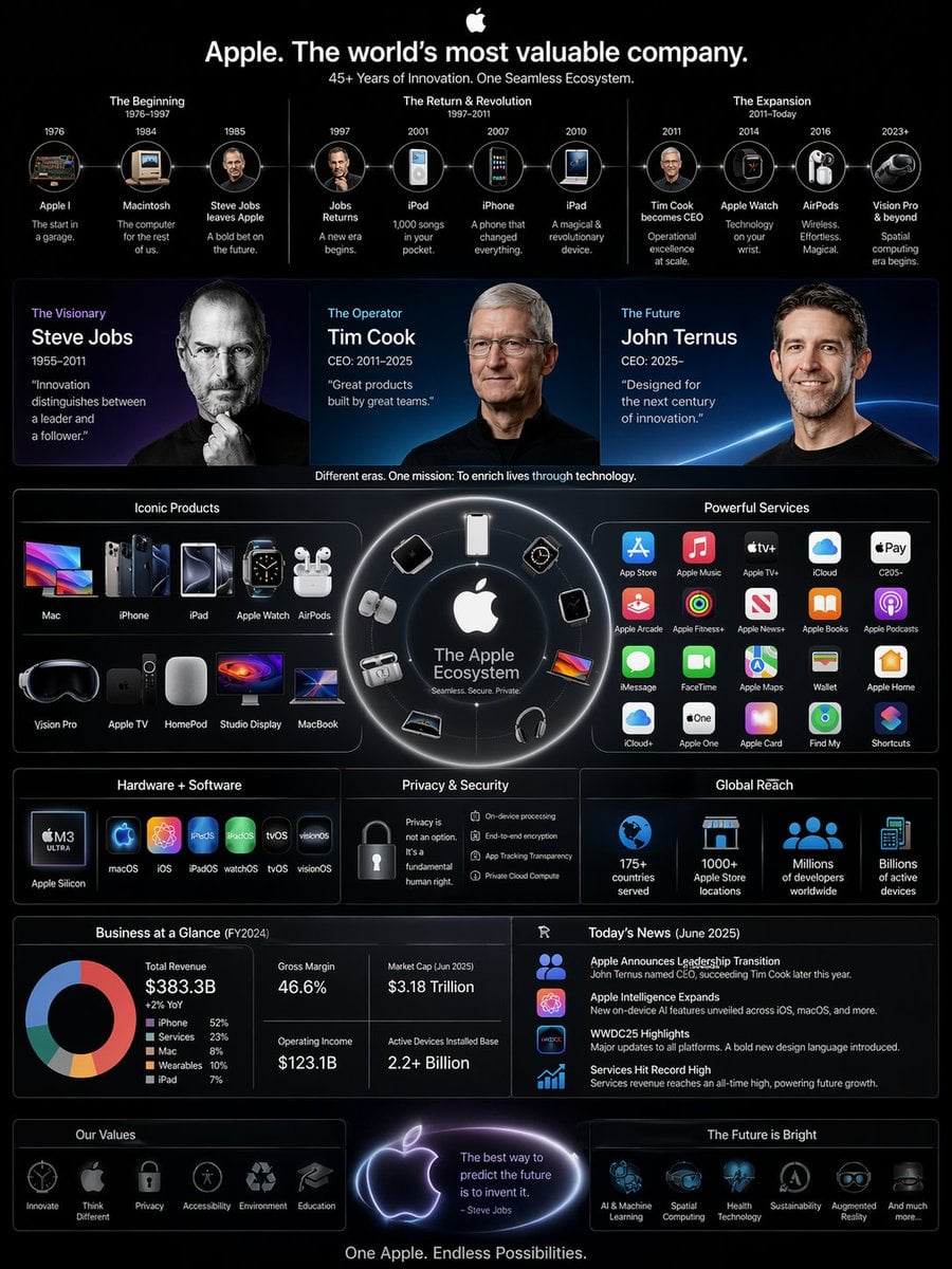 高复杂度信息图:结合今天的新闻,CEO 换成了Ternus,信息图要竖版 3:4要有乔布斯、cook、Ternus 三人头像,以及产品,以及超多苹果服务标志,整体风格偏 WWDC 的苹果风格,完整展现苹果庞大商业帝国
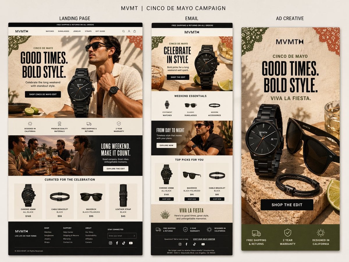 Create a premium presentation-style campaign board for MVMT’s Cinco de Mayo campaign on a soft warm neutral background.
At the top, add the title:
“MVMT | CINCO DE MAYO CAMPAIGN”
Below it, show three clearly labeled vertical panels side by side with subtle shadows:
“LANDING PAGE”
“EMAIL”
“AD CREATIVE”
Overall style:
Clean, premium, masculine-leaning, modern DTC design. The image should feel like a polished creative review board, not a collage. All three panels should clearly belong to the same campaign, with shared typography, colors, product styling, and seasonal details.
Use a warm, elevated palette:
cream, sand, stone, black, charcoal, dark olive, terracotta, muted green, and warm golden accents.
Cinco de Mayo direction:
Tasteful and refined, not cheesy. Use subtle festive touches like papel picado-inspired accents, citrus, warm stone textures, celebratory drinks, and sunlit lifestyle styling.
Shared headline direction:
“GOOD TIMES. BOLD STYLE.”
Optional secondary line:
“VIVA LA FIESTA.”
Panel 1 — Landing Page:
Create the widest and most detailed panel as a tall desktop ecommerce landing page.
Include:
- MVMT site header
- hero with bold headline
- premium black watch as hero product
- stylish male lifestyle model
- CTA button
- icon/value prop row
- supporting lifestyle banner
- curated product grid
- realistic footer
Panel 2 — Email:
Create a slimmer tall ecommerce email mockup.
Include:
- promo bar
- MVMT logo and header
- hero section with same campaign art direction
- curated category or product row
- supporting lifestyle block
- featured products section
- compact footer
Panel 3 — Ad Creative:
Create a bold vertical Facebook ad.
Include:
- strong headline
- premium product composition with black watch, sunglasses, and bracelet
- citrus and celebratory props
- CTA button
- compact benefit strip at the bottom with messages like:
“FREE SHIPPING & RETURNS”
“2 YEAR WARRANTY”
“DESIGNED IN CALIFORNIA”
Important:
- landing page should feel broader and more layered
- email should feel modular and structured
- ad should feel bold, simple, and conversion-focused
- labels above each panel should be clearly visible
- text should be mostly legible
- everything should feel premium, realistic, and cohesive
Avoid:
cheesy fiesta graphics, bright rainbow colors, clutter, generic templates, messy collage styling, or cartoonish holiday visuals.
Output:
A highly realistic single-image campaign board showing a landing page, email, and ad creative for MVMT’s Cinco de Mayo campaign, all clearly labeled and designed as one cohesive system.
Create a premium presentation-style campaign board for MVMT’s Cinco de Mayo campaign on a soft warm neutral background.
At the top, add the title:
“MVMT | CINCO DE MAYO CAMPAIGN”
Below it, show three clearly labeled vertical panels side by side with subtle shadows:
“LANDING PAGE”
“EMAIL”
“AD CREATIVE”
Overall style:
Clean, premium, masculine-leaning, modern DTC design. The image should feel like a polished creative review board, not a collage. All three panels should clearly belong to the same campaign, with shared typography, colors, product styling, and seasonal details.
Use a warm, elevated palette:
cream, sand, stone, black, charcoal, dark olive, terracotta, muted green, and warm golden accents.
Cinco de Mayo direction:
Tasteful and refined, not cheesy. Use subtle festive touches like papel picado-inspired accents, citrus, warm stone textures, celebratory drinks, and sunlit lifestyle styling.
Shared headline direction:
“GOOD TIMES. BOLD STYLE.”
Optional secondary line:
“VIVA LA FIESTA.”
Panel 1 — Landing Page:
Create the widest and most detailed panel as a tall desktop ecommerce landing page.
Include:
- MVMT site header
- hero with bold headline
- premium black watch as hero product
- stylish male lifestyle model
- CTA button
- icon/value prop row
- supporting lifestyle banner
- curated product grid
- realistic footer
Panel 2 — Email:
Create a slimmer tall ecommerce email mockup.
Include:
- promo bar
- MVMT logo and header
- hero section with same campaign art direction
- curated category or product row
- supporting lifestyle block
- featured products section
- compact footer
Panel 3 — Ad Creative:
Create a bold vertical Facebook ad.
Include:
- strong headline
- premium product composition with black watch, sunglasses, and bracelet
- citrus and celebratory props
- CTA button
- compact benefit strip at the bottom with messages like:
“FREE SHIPPING & RETURNS”
“2 YEAR WARRANTY”
“DESIGNED IN CALIFORNIA”
Important:
- landing page should feel broader and more layered
- email should feel modular and structured
- ad should feel bold, simple, and conversion-focused
- labels above each panel should be clearly visible
- text should be mostly legible
- everything should feel premium, realistic, and cohesive
Avoid:
cheesy fiesta graphics, bright rainbow colors, clutter, generic templates, messy collage styling, or cartoonish holiday visuals.
Output:
A highly realistic single-image campaign board showing a landing page, email, and ad creative for MVMT’s Cinco de Mayo campaign, all clearly labeled and designed as one cohesive system.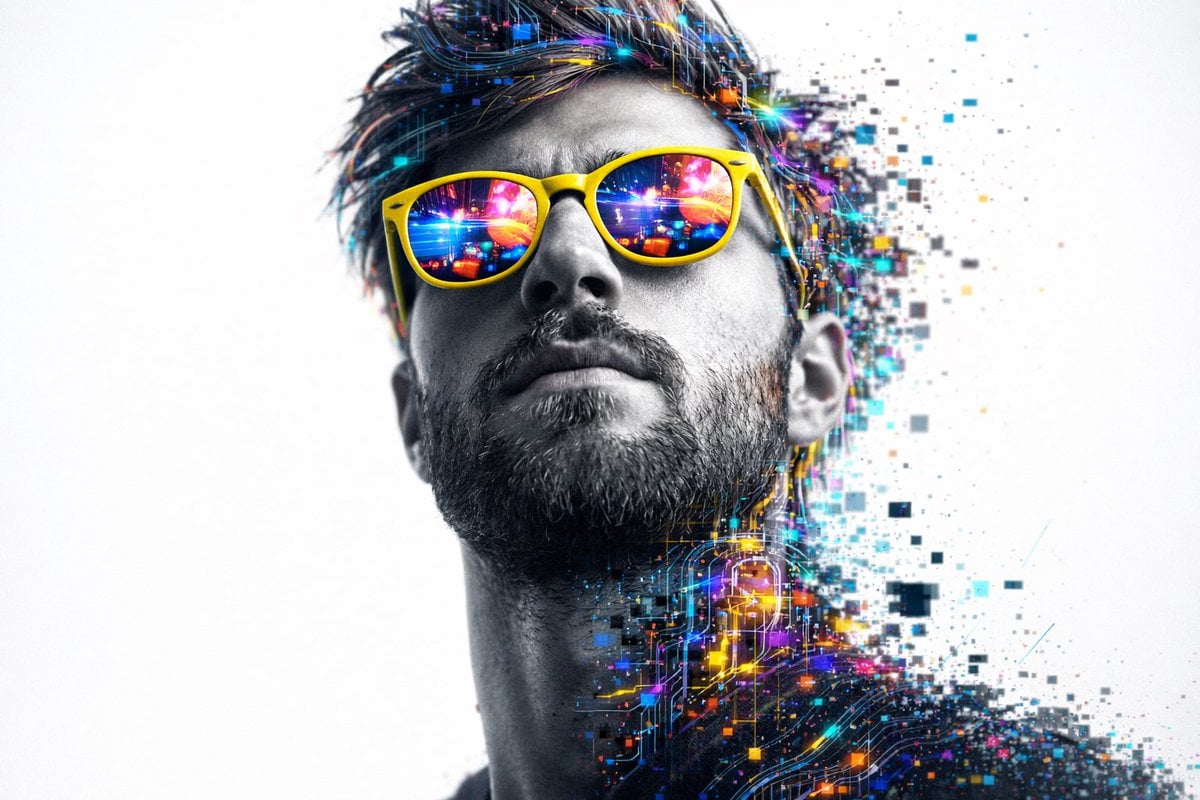 A hyper-realistic 8K close-up portrait of a person's head and upper neck, shot from a slightly low-angle perspective looking upward.
Use the uploaded image as the face reference - the face must match 100% exactly (same identity, facial structure, proportions, skin details, and expression). Do not alter the face in any way.
The subject is wearing bright yellow sunglasses with reflective lenses showing colorful abstract digital scenes in shades of pink, blue, and yellow.
The face is rendered in detailed grayscale, showing realistic skin texture, pores, and light stubble on the jawline, creating strong contrast with the rest of the head.
The hair and most of the head and neck are made of glowing digital circuit patterns, abstract shapes, lines, and data streams in vibrant colors like magenta, cyan, blue, green, yellow, and orange. These elements appear layered and complex, with a soft internal glow.
Parts of the digital head are breaking apart and dissolving outward into pixels, lines, and glitch fragments that fade into a clean white background, giving a glitch-art, futuristic look.
Cinematic lighting highlights one side of the face, with shadows under the chin and subtle rim lighting around the digital elements.
Overall style is futuristic, cyber-inspired, high-detail, and photorealistic.
A hyper-realistic 8K close-up portrait of a person's head and upper neck, shot from a slightly low-angle perspective looking upward.
Use the uploaded image as the face reference - the face must match 100% exactly (same identity, facial structure, proportions, skin details, and expression). Do not alter the face in any way.
The subject is wearing bright yellow sunglasses with reflective lenses showing colorful abstract digital scenes in shades of pink, blue, and yellow.
The face is rendered in detailed grayscale, showing realistic skin texture, pores, and light stubble on the jawline, creating strong contrast with the rest of the head.
The hair and most of the head and neck are made of glowing digital circuit patterns, abstract shapes, lines, and data streams in vibrant colors like magenta, cyan, blue, green, yellow, and orange. These elements appear layered and complex, with a soft internal glow.
Parts of the digital head are breaking apart and dissolving outward into pixels, lines, and glitch fragments that fade into a clean white background, giving a glitch-art, futuristic look.
Cinematic lighting highlights one side of the face, with shadows under the chin and subtle rim lighting around the digital elements.
Overall style is futuristic, cyber-inspired, high-detail, and photorealistic.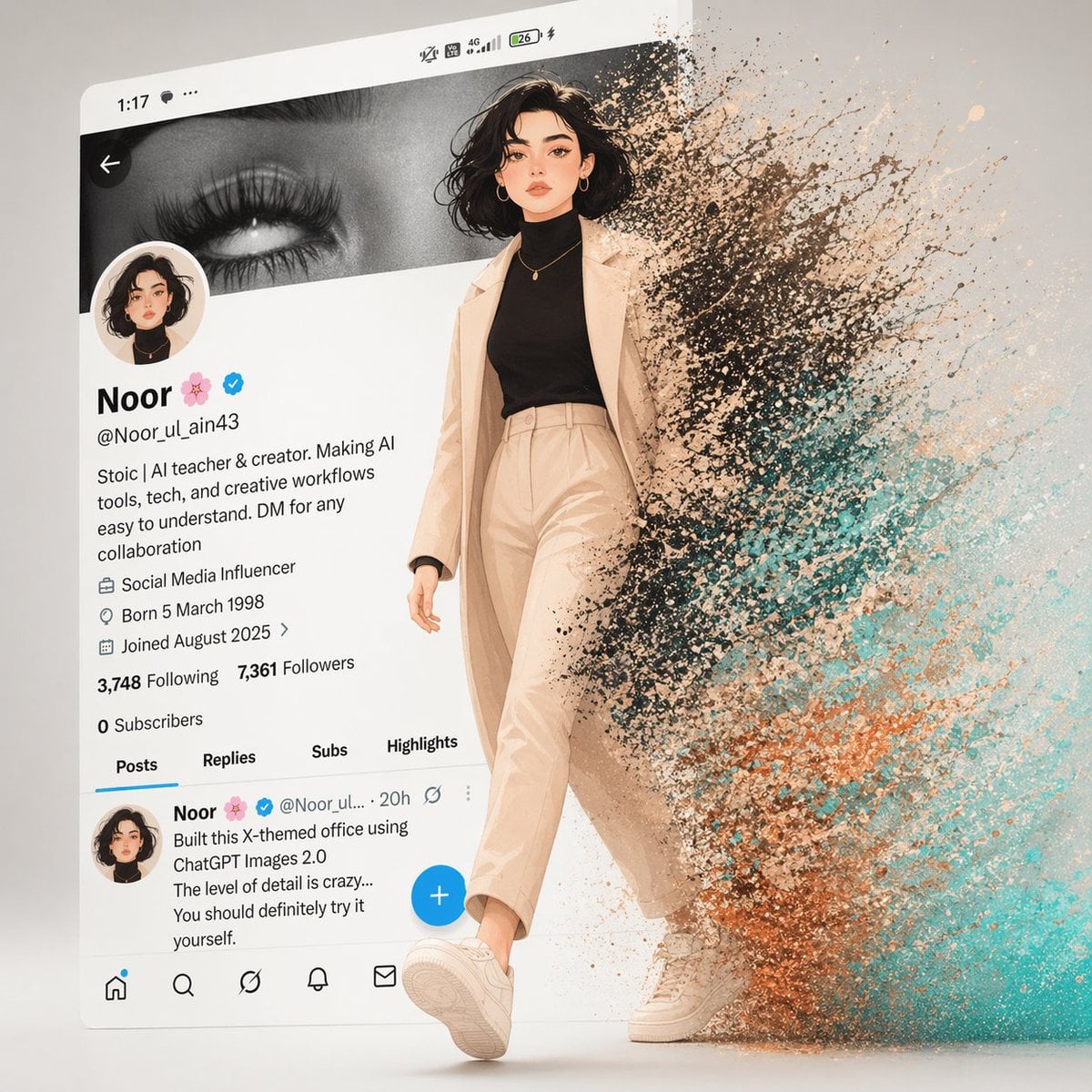 A cinematic digital artwork of a stylish animated girl walking out of a modern X (Twitter) profile interface. The background shows a real mobile UI profile screen with the name "Noor 🌸", verified badge, username @Noor_ul_ain43, and detailed bio.
The girl matches the profile picture — soft aesthetic illustration style, short wavy black hair, gold hoop earrings, minimal makeup, wearing a black turtleneck and beige coat with matching pants and sneakers.
She is stepping forward confidently from the screen into real space. The right half of her body dissolves into dynamic particles — a mix of black dust, teal, and orange energy splashes, flowing outward like liquid + digital fragments.
Clean composition: left side = structured UI, right side = abstract particle explosion. Soft cinematic lighting, depth of field, ultra-detailed textures, smooth shadows, 4K render, octane render, Unreal Engine 5 style, trending on ArtStation.
A cinematic digital artwork of a stylish animated girl walking out of a modern X (Twitter) profile interface. The background shows a real mobile UI profile screen with the name "Noor 🌸", verified badge, username @Noor_ul_ain43, and detailed bio.
The girl matches the profile picture — soft aesthetic illustration style, short wavy black hair, gold hoop earrings, minimal makeup, wearing a black turtleneck and beige coat with matching pants and sneakers.
She is stepping forward confidently from the screen into real space. The right half of her body dissolves into dynamic particles — a mix of black dust, teal, and orange energy splashes, flowing outward like liquid + digital fragments.
Clean composition: left side = structured UI, right side = abstract particle explosion. Soft cinematic lighting, depth of field, ultra-detailed textures, smooth shadows, 4K render, octane render, Unreal Engine 5 style, trending on ArtStation.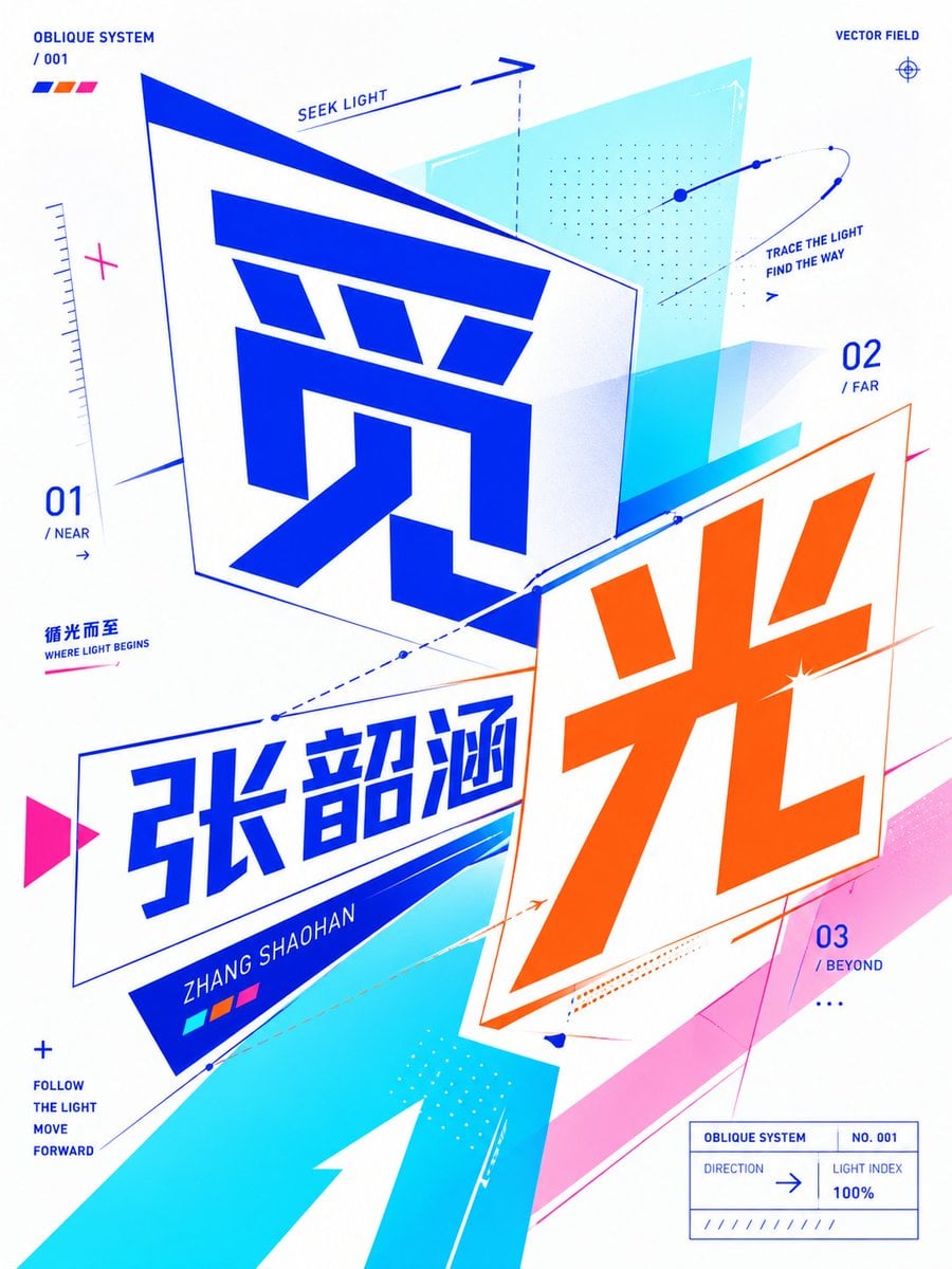 请基于用户输入的【核心文字 / 单词 / 词组 / 短句 / 字母】,创作一张高完成度的「斜向透视平面字体概念海报 / Oblique Planar Perspective Typographic Poster」。
用户输入:[主题文字];
文字语言:[中文 / 英文 / 中英混排];
可选补充语境:[____];
可选情绪倾向:[____];
可选禁用元素:[____]。
这不是普通插画,不是简单把文字放大后的字效海报,也不是传统正面平铺式平面排版,而是一张以“文字为主视觉核心”的现代实验性字体海报。整体必须采用「斜向透视平面字体构成 / Oblique Planar Perspective Typography」的方式来设计:文字不应完全贴在正面平面上,而应像被放置在不同倾斜角度的二维平面中,通过斜向基准线、透视压缩、平面偏转、角度切入、错位构成、向量指向、方向线条、半透明几何平面与模块化色块,共同建立一种“仍然是平面设计,但具有明显角度感、空间方向感、视觉张力和向量关系”的字体构成效果。
请先真正理解用户输入内容的字面含义、情绪气质、隐含象征、文化联想、心理感受与语义张力,再把这些理解转译成一个具有“方向性、倾斜关系、平面透视感和视觉对抗 / 连接关系”的字体海报系统。如果主题偏情绪型,请重点通过斜向文字平面的距离关系、重心偏移、留白方向、线条走势、模块密度变化和色块压迫 / 释放来表达;如果主题偏动作型,请重点通过倾斜推进、速度线、方向箭头、透视切片、错位平面和向量轨迹来表达;如果主题偏关系型,请重点通过多个文字主体、几何平面和图形模块之间的角度差、相交、重叠、对峙、包裹、切割和中介结构来表达;如果主题偏抽象概念型,请先找到一个简洁但具有视觉转译潜力的抽象隐喻,再通过斜向透视字体、向量辅助系统、局部遮挡、层级偏移、模块重复和变形网格来构建画面。
整体画面必须呈现为一张现代、锐利、清亮、时尚、有实验性、有传播力、有视觉记忆点的高完成度字体海报。用户输入的文字必须成为第一视觉主体,是整个海报的核心内容。文字可以横排、竖排、拆分、错位、分组、重组、局部裁切、局部遮挡、嵌套、倾斜、透视压缩、斜向旋转,甚至分别放置在不同角度的二维平面中,但必须始终保持较高识别度与清晰可读性。画面中至少要让观众明显感受到:文字不再是正面贴平,而是进入了一个由多个倾斜平面和方向关系组成的平面空间系统中。
请重点强化以下风格特征:文字有斜向角度感、近大远小的平面透视感、不同方向的向量关系、倾斜基准线、辅助箭头、几何切面、模块推进、局部框线、数据感标注、小型目录式辅助说明、少量点阵与路径线。可以让不同的文字或文字组处在不同倾斜平面中,形成彼此之间的视角差、方向冲突、视觉对话或张力关系。图形元素必须围绕文字构建,而不是独立装饰;它们应该支撑文字、切割文字、包裹文字、延伸文字的方向、强化文字的倾斜动势,并与文字共同构成一个完整的视觉句子。
视觉语言上,请采用 modern graphic design、oblique planar perspective typography、experimental typography、bold typographic composition、flat vector aesthetics、high-contrast graphic layout、contemporary editorial poster、crisp vector-like precision 的方向。整体不是写实,不是摄影,不是复古文学封面,不是包豪斯旧海报感,不是厚重肌理风,不是暗沉艺术海报,也不是普通 PPT 封面。它应当是更当代、更清亮、更锋利、更数字化、更具有设计公司提案感与展览海报感的视觉结果。
【新版配色要求】
配色必须鲜亮、透亮、清亮、艳丽、高对比,但不要固定使用蓝色与橙色组合,也不要默认落入常见的蓝橙撞色方案。请根据主题语义、情绪气质和视觉隐喻,自动生成一组更大胆、更有想象力、更有新鲜感的现代高对比配色。允许使用非常规组合、跳跃性色彩、强烈撞色、冷暖冲突、霓虹感、数码感、未来感或艺术化配色,但整体必须仍然有秩序、有审美控制、有设计感,不能杂乱失控。
请优先采用“2 个主色 + 1 到 2 个高亮点缀色 + 留白 / 结构支点色”的配色组织方式。可以探索但不限于以下方向:荧光绿 + 品红 + 冷白、亮黄 + 紫罗兰 + 黑色、酸橙绿 + 深紫 + 青蓝、玫红 + 青绿 + 银白、樱桃红 + 湖蓝 + 纯白、薄荷青 + 亮红 + 深蓝、荧光黄 + 桃红 + 紫色、珊瑚橙 + 青蓝 + 白色、多彩数码拼接配色等。每次生成时,请尽量形成一套独立的色彩记忆点,不要重复单一固定主配色,不要让作品系列都长得像同一张图换字。
文字颜色不要全部使用纯黑,可以根据构图关系,让不同文字主体使用不同高饱和色,或在同一组大字中形成主次色分配。允许少量深色作为结构支点,但整体画面应以鲜亮、清透、醒目、前卫的色彩印象为主。色彩应服务于语义表达,而不是仅仅为了热闹;要让观众觉得颜色是“被设计过的”,而不是随机堆砌的。
构图应大胆、倾斜、具有推进感和方向感,但同时要控制画面秩序。建议采用 1 组核心标题主体、1 组斜向透视文字平面系统、1 组几何向量与色块结构、少量辅助标注信息与点线符号。画面需要保留足够留白,让高饱和色与倾斜文字更有呼吸感和展览海报感。可以加入少量小字说明、标签、编号、英文关键词、极简副标题或短句,用来强化概念,但必须克制,不要抢夺主标题的视觉权重。辅助信息可模拟视觉识别系统或编辑设计中的注释语言,例如短词、参数、索引、方向说明、概念标签等。
字体与排版必须现代、清晰、醒目、有力量,并且具有一定实验性。中文适合使用几何无衬线、现代设计感强的标题字、窄长字形或有切面感的字形;英文适合使用 bold grotesk、condensed sans、geometric sans、editorial sans 等。允许局部拉伸、压缩、斜切、透视变形、切片错位,但不要把文字做成真实 3D 挤出字,不要厚重投影,不要真实立体建模,不要金属字,不要玻璃字,不要浮雕字。重点是“平面中的空间感”,而不是“物理三维立体感”。
图形元素可使用:斜向矩形、倾斜平面框、三角切角、圆点系统、箭头、路径线、细线辅助网格、透视边框、方向向量、点阵模块、数据感短线、色块面片、半透明几何切片、局部环形线、分区标签、小尺寸索引信息等。这些元素都必须服务主题语义和字体构成,不应沦为纯装饰。
请避免以下问题:不要做成普通正面平铺字体海报、不要做成传统极简主义排版封面、不要做成写实摄影或插画、不要做成厚重 3D 字、不要做成复古低饱和或米灰色调海报、不要堆砌无关图形、不要过度装饰、不要让文字不可读、不要让画面脏乱拥挤、不要让图形与主题词脱节、不要反复默认同一套主配色。
如果适合,请自动生成一句极短的副标题或概念短句,用来辅助解释主题,例如 “Between ____ and ____”、“The tension of ____”、“A state of ____”、“Where ____ begins”,或根据中文语境生成一句更简洁的中文短句,但必须保持简短、克制、设计化。
最终输出应是一张:高完成度、现代、鲜亮、高对比、平面、锐利、实验性强、具有斜向透视字体构成感、可读且有设计感、并且在配色上更大胆自由、更有想象力、更不落入固定蓝橙套路的现代字体概念海报。
请基于用户输入的【核心文字 / 单词 / 词组 / 短句 / 字母】,创作一张高完成度的「斜向透视平面字体概念海报 / Oblique Planar Perspective Typographic Poster」。
用户输入:[主题文字];
文字语言:[中文 / 英文 / 中英混排];
可选补充语境:[____];
可选情绪倾向:[____];
可选禁用元素:[____]。
这不是普通插画,不是简单把文字放大后的字效海报,也不是传统正面平铺式平面排版,而是一张以“文字为主视觉核心”的现代实验性字体海报。整体必须采用「斜向透视平面字体构成 / Oblique Planar Perspective Typography」的方式来设计:文字不应完全贴在正面平面上,而应像被放置在不同倾斜角度的二维平面中,通过斜向基准线、透视压缩、平面偏转、角度切入、错位构成、向量指向、方向线条、半透明几何平面与模块化色块,共同建立一种“仍然是平面设计,但具有明显角度感、空间方向感、视觉张力和向量关系”的字体构成效果。
请先真正理解用户输入内容的字面含义、情绪气质、隐含象征、文化联想、心理感受与语义张力,再把这些理解转译成一个具有“方向性、倾斜关系、平面透视感和视觉对抗 / 连接关系”的字体海报系统。如果主题偏情绪型,请重点通过斜向文字平面的距离关系、重心偏移、留白方向、线条走势、模块密度变化和色块压迫 / 释放来表达;如果主题偏动作型,请重点通过倾斜推进、速度线、方向箭头、透视切片、错位平面和向量轨迹来表达;如果主题偏关系型,请重点通过多个文字主体、几何平面和图形模块之间的角度差、相交、重叠、对峙、包裹、切割和中介结构来表达;如果主题偏抽象概念型,请先找到一个简洁但具有视觉转译潜力的抽象隐喻,再通过斜向透视字体、向量辅助系统、局部遮挡、层级偏移、模块重复和变形网格来构建画面。
整体画面必须呈现为一张现代、锐利、清亮、时尚、有实验性、有传播力、有视觉记忆点的高完成度字体海报。用户输入的文字必须成为第一视觉主体,是整个海报的核心内容。文字可以横排、竖排、拆分、错位、分组、重组、局部裁切、局部遮挡、嵌套、倾斜、透视压缩、斜向旋转,甚至分别放置在不同角度的二维平面中,但必须始终保持较高识别度与清晰可读性。画面中至少要让观众明显感受到:文字不再是正面贴平,而是进入了一个由多个倾斜平面和方向关系组成的平面空间系统中。
请重点强化以下风格特征:文字有斜向角度感、近大远小的平面透视感、不同方向的向量关系、倾斜基准线、辅助箭头、几何切面、模块推进、局部框线、数据感标注、小型目录式辅助说明、少量点阵与路径线。可以让不同的文字或文字组处在不同倾斜平面中,形成彼此之间的视角差、方向冲突、视觉对话或张力关系。图形元素必须围绕文字构建,而不是独立装饰;它们应该支撑文字、切割文字、包裹文字、延伸文字的方向、强化文字的倾斜动势,并与文字共同构成一个完整的视觉句子。
视觉语言上,请采用 modern graphic design、oblique planar perspective typography、experimental typography、bold typographic composition、flat vector aesthetics、high-contrast graphic layout、contemporary editorial poster、crisp vector-like precision 的方向。整体不是写实,不是摄影,不是复古文学封面,不是包豪斯旧海报感,不是厚重肌理风,不是暗沉艺术海报,也不是普通 PPT 封面。它应当是更当代、更清亮、更锋利、更数字化、更具有设计公司提案感与展览海报感的视觉结果。
【新版配色要求】
配色必须鲜亮、透亮、清亮、艳丽、高对比,但不要固定使用蓝色与橙色组合,也不要默认落入常见的蓝橙撞色方案。请根据主题语义、情绪气质和视觉隐喻,自动生成一组更大胆、更有想象力、更有新鲜感的现代高对比配色。允许使用非常规组合、跳跃性色彩、强烈撞色、冷暖冲突、霓虹感、数码感、未来感或艺术化配色,但整体必须仍然有秩序、有审美控制、有设计感,不能杂乱失控。
请优先采用“2 个主色 + 1 到 2 个高亮点缀色 + 留白 / 结构支点色”的配色组织方式。可以探索但不限于以下方向:荧光绿 + 品红 + 冷白、亮黄 + 紫罗兰 + 黑色、酸橙绿 + 深紫 + 青蓝、玫红 + 青绿 + 银白、樱桃红 + 湖蓝 + 纯白、薄荷青 + 亮红 + 深蓝、荧光黄 + 桃红 + 紫色、珊瑚橙 + 青蓝 + 白色、多彩数码拼接配色等。每次生成时,请尽量形成一套独立的色彩记忆点,不要重复单一固定主配色,不要让作品系列都长得像同一张图换字。
文字颜色不要全部使用纯黑,可以根据构图关系,让不同文字主体使用不同高饱和色,或在同一组大字中形成主次色分配。允许少量深色作为结构支点,但整体画面应以鲜亮、清透、醒目、前卫的色彩印象为主。色彩应服务于语义表达,而不是仅仅为了热闹;要让观众觉得颜色是“被设计过的”,而不是随机堆砌的。
构图应大胆、倾斜、具有推进感和方向感,但同时要控制画面秩序。建议采用 1 组核心标题主体、1 组斜向透视文字平面系统、1 组几何向量与色块结构、少量辅助标注信息与点线符号。画面需要保留足够留白,让高饱和色与倾斜文字更有呼吸感和展览海报感。可以加入少量小字说明、标签、编号、英文关键词、极简副标题或短句,用来强化概念,但必须克制,不要抢夺主标题的视觉权重。辅助信息可模拟视觉识别系统或编辑设计中的注释语言,例如短词、参数、索引、方向说明、概念标签等。
字体与排版必须现代、清晰、醒目、有力量,并且具有一定实验性。中文适合使用几何无衬线、现代设计感强的标题字、窄长字形或有切面感的字形;英文适合使用 bold grotesk、condensed sans、geometric sans、editorial sans 等。允许局部拉伸、压缩、斜切、透视变形、切片错位,但不要把文字做成真实 3D 挤出字,不要厚重投影,不要真实立体建模,不要金属字,不要玻璃字,不要浮雕字。重点是“平面中的空间感”,而不是“物理三维立体感”。
图形元素可使用:斜向矩形、倾斜平面框、三角切角、圆点系统、箭头、路径线、细线辅助网格、透视边框、方向向量、点阵模块、数据感短线、色块面片、半透明几何切片、局部环形线、分区标签、小尺寸索引信息等。这些元素都必须服务主题语义和字体构成,不应沦为纯装饰。
请避免以下问题:不要做成普通正面平铺字体海报、不要做成传统极简主义排版封面、不要做成写实摄影或插画、不要做成厚重 3D 字、不要做成复古低饱和或米灰色调海报、不要堆砌无关图形、不要过度装饰、不要让文字不可读、不要让画面脏乱拥挤、不要让图形与主题词脱节、不要反复默认同一套主配色。
如果适合,请自动生成一句极短的副标题或概念短句,用来辅助解释主题,例如 “Between ____ and ____”、“The tension of ____”、“A state of ____”、“Where ____ begins”,或根据中文语境生成一句更简洁的中文短句,但必须保持简短、克制、设计化。
最终输出应是一张:高完成度、现代、鲜亮、高对比、平面、锐利、实验性强、具有斜向透视字体构成感、可读且有设计感、并且在配色上更大胆自由、更有想象力、更不落入固定蓝橙套路的现代字体概念海报。