
提示詞
Nano Banana · 產品與品牌提示詞
請扮演世界級編輯設計師 階段 動態主體邏輯 主體選擇…|Nano Banana 提示詞
這個提示詞可以生成什麼?
這個 Nano Banana 提示詞可用來生成以「請扮演世界級編輯設計師 階段 動態主體邏輯 主體選擇 自主分析 分層 三明治效果 將主體與背景形狀交織 汽車」為核心的 AI 圖片。頁面保留完整原文指令與生成參考圖,並整理來源、作者、日期和授權資訊,方便先重現畫面,再逐項修改主體、場景、光線、鏡位與視覺風格。
探索更多
更多相關內容
![[BRAND NAME] | [HEADLINE] | [SUB-TEXT] | [CTA]. Act as a Senior Art Director.
P](/api/storage/file?key=prompts%2F2026316195977146728%2F0.jpg) [BRAND NAME] | [HEADLINE] | [SUB-TEXT] | [CTA]. Act as a Senior Art Director.
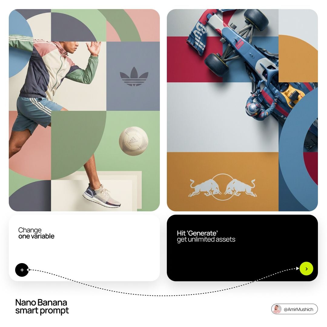
PHASE 1: INTEGRATED COMPOSITION & OVERLAP.
- Layout: Seamless fusion of 2D graphics and 3D photography.
- Overlap Logic: The subject and their primary "Product Prop" (e.g., a car, a device) must physically overlap the graphic panel to break the "wall" between design and photo.
- Unity: Geometric shapes from the graphic side must bleed into the photographic sky area.
PHASE 2: BRAND & CATEGORY SIMULATION.
Autonomously analyze the [BRAND NAME] and its industry category:
- INDUSTRY CONTEXT:
* If Automotive: Include the vehicle and a person interacting with it.
* If Tech: Include flagship devices/gadgets.
* If Fashion/Lifestyle: Focus on editorial poses and premium accessories.
- SHAPE SIMULATION: Match shapes to brand identity (e.g., Sharp/Speed for Auto, Minimalist/Grid for Tech).
- COLOR SIMULATION: Use the brand's primary signature hue for both the graphic pattern and the subject's outfit/accents.
PHASE 3: TYPOGRAPHY & CUSTOM CONTENT.
- Headline: Display "[HEADLINE]" in a bold, modern Sans-Serif font. (If [HEADLINE] is empty, generate a high-energy slogan for [BRAND NAME]).
- Sub-headline: Display "[SUB-TEXT]" below the headline.
- Button: Create a minimalist pill-shaped CTA button with the text: "[CTA]".
- Interaction: Text layers should have 3D depth, sitting partially behind the subject or product prop.
PHASE 4: PHOTOGRAPHY & SUBJECT.
- Perspective: Extreme low-angle (worm’s eye view) looking up.
- Subject: A diverse persona reflecting the brand's audience.
- Environment: Massive, clear blue sky as the backdrop.
- Visual Link: Subject's styling must incorporate the Brand's primary color.
PHASE 5: FINAL VISUAL STYLE.
High-end commercial aesthetic. Crisp, saturated, professional fusion of flat vector art and realistic photography.
[BRAND NAME] | [HEADLINE] | [SUB-TEXT] | [CTA]. Act as a Senior Art Director.
PHASE 1: INTEGRATED COMPOSITION & OVERLAP.
- Layout: Seamless fusion of 2D graphics and 3D photography.
- Overlap Logic: The subject and their primary "Product Prop" (e.g., a car, a device) must physically overlap the graphic panel to break the "wall" between design and photo.
- Unity: Geometric shapes from the graphic side must bleed into the photographic sky area.
PHASE 2: BRAND & CATEGORY SIMULATION.
Autonomously analyze the [BRAND NAME] and its industry category:
- INDUSTRY CONTEXT:
* If Automotive: Include the vehicle and a person interacting with it.
* If Tech: Include flagship devices/gadgets.
* If Fashion/Lifestyle: Focus on editorial poses and premium accessories.
- SHAPE SIMULATION: Match shapes to brand identity (e.g., Sharp/Speed for Auto, Minimalist/Grid for Tech).
- COLOR SIMULATION: Use the brand's primary signature hue for both the graphic pattern and the subject's outfit/accents.
PHASE 3: TYPOGRAPHY & CUSTOM CONTENT.
- Headline: Display "[HEADLINE]" in a bold, modern Sans-Serif font. (If [HEADLINE] is empty, generate a high-energy slogan for [BRAND NAME]).
- Sub-headline: Display "[SUB-TEXT]" below the headline.
- Button: Create a minimalist pill-shaped CTA button with the text: "[CTA]".
- Interaction: Text layers should have 3D depth, sitting partially behind the subject or product prop.
PHASE 4: PHOTOGRAPHY & SUBJECT.
- Perspective: Extreme low-angle (worm’s eye view) looking up.
- Subject: A diverse persona reflecting the brand's audience.
- Environment: Massive, clear blue sky as the backdrop.
- Visual Link: Subject's styling must incorporate the Brand's primary color.
PHASE 5: FINAL VISUAL STYLE.
High-end commercial aesthetic. Crisp, saturated, professional fusion of flat vector art and realistic photography.![Create an exploded products with inner mechanics [product], high-end product adv](/api/storage/file?key=prompts%2F2010350005870276897%2F0.jpg) Create an exploded products with inner mechanics [product], high-end product advertising, white seamless background, exploded view with inner mechanics revealed, outer shell hovering above core, micro screws and components suspended, perfect alignment guides implied, crisp soft shadow, ultra realistic, macro product photography, 100mm lens look, f/8, 8k, 1:1
Create an exploded products with inner mechanics [product], high-end product advertising, white seamless background, exploded view with inner mechanics revealed, outer shell hovering above core, micro screws and components suspended, perfect alignment guides implied, crisp soft shadow, ultra realistic, macro product photography, 100mm lens look, f/8, 8k, 1:1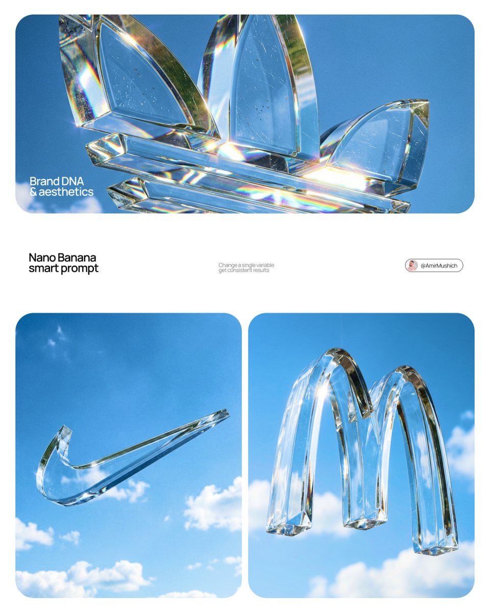 Act as a High-End Product Photographer and CGI Artist.
PHASE 1: SUBJECT & LOGIC
Generate a massive, perfectly centered, three-dimensional physical sculpture of the official, unaltered corporate logo for [BRAND NAME]. The sculpture must strictly adhere to the brand’s precise logo geometry and proportions (1:1 from brandbook). The sculpture is suspended in mid-air. Autonomously identify the exact official shape and structure of the [BRAND NAME] logo and render it as a single, flawless glass object without any modifications.
PHASE 2: MATERIALITY (GLASS)
The entire logo is made of hyper-realistic, optical-grade crystal glass (not water, not gel). The material is solid, colorless, and boasts high clarity with a high refractive index. It must look heavy and монолитное (monolithic). The glass structure contains subtle, photorealistic microscopic flaws: fine polished scratches on the surface and minor internal inclusions (dust particles/seed bubbles, very few) to avoid “CGI plastic.” The edges must be precision-beveled and fire-polished.
PHASE 3: ENVIRONMENT & CAUSTICS
The logo is suspended against a strictly clean, bright blue sky with sparse, naturally defined white cumulus clouds. NO land, NO trees, NO palms. The background is purely atmospheric. The focus is entirely on the glass logo. Critically render hyper-realistic, complex glass caustics: intense, sharp patterns of focused light and color (refractions of the blue sky) cast inside and onto the surface of the glass form due to the sunlight passing through it.
TECH SPECS
Rendered with Arnold or Octane. Phase One XF, 120mm Macro lens. Aperture f/5.6 for sharp depth across the entire glass sculpture. Intense, direct sunlight (hard lighting) to maximize caustics. Global illumination, ray-traced refractions (double-sided geometry), and chromatic aberration emulation (subtle) for optical realism. Fine grain film emulation (Fujifilm Velvia 50).
Act as a High-End Product Photographer and CGI Artist.
PHASE 1: SUBJECT & LOGIC
Generate a massive, perfectly centered, three-dimensional physical sculpture of the official, unaltered corporate logo for [BRAND NAME]. The sculpture must strictly adhere to the brand’s precise logo geometry and proportions (1:1 from brandbook). The sculpture is suspended in mid-air. Autonomously identify the exact official shape and structure of the [BRAND NAME] logo and render it as a single, flawless glass object without any modifications.
PHASE 2: MATERIALITY (GLASS)
The entire logo is made of hyper-realistic, optical-grade crystal glass (not water, not gel). The material is solid, colorless, and boasts high clarity with a high refractive index. It must look heavy and монолитное (monolithic). The glass structure contains subtle, photorealistic microscopic flaws: fine polished scratches on the surface and minor internal inclusions (dust particles/seed bubbles, very few) to avoid “CGI plastic.” The edges must be precision-beveled and fire-polished.
PHASE 3: ENVIRONMENT & CAUSTICS
The logo is suspended against a strictly clean, bright blue sky with sparse, naturally defined white cumulus clouds. NO land, NO trees, NO palms. The background is purely atmospheric. The focus is entirely on the glass logo. Critically render hyper-realistic, complex glass caustics: intense, sharp patterns of focused light and color (refractions of the blue sky) cast inside and onto the surface of the glass form due to the sunlight passing through it.
TECH SPECS
Rendered with Arnold or Octane. Phase One XF, 120mm Macro lens. Aperture f/5.6 for sharp depth across the entire glass sculpture. Intense, direct sunlight (hard lighting) to maximize caustics. Global illumination, ray-traced refractions (double-sided geometry), and chromatic aberration emulation (subtle) for optical realism. Fine grain film emulation (Fujifilm Velvia 50).![[BRAND NAME]: The name of the brand.
Goal: Generate a single, minimalist, and su](/api/storage/file?key=prompts%2F2032908105994961090%2F0.jpg) [BRAND NAME]: The name of the brand.
Goal: Generate a single, minimalist, and surreal image where a cloud is shaped like the brand's logo.
1. THE LOGO CLOUD
- **Subject**: A massive, photorealistic cumulus cloud in the exact geometric shape of the [BRAND NAME] logo.
- **Texture**: Puffy, soft, and voluminous with natural sunlight illuminating the edges.
- **Volume**: 3D sculptural appearance with realistic shadows within the cloud folds to show depth.
2. ENVIRONMENT & BACKGROUND
- **Sky**: A vast, clear, vibrant blue summer sky.
- **Secondary Elements**: A few small, wispy, natural clouds scattered far in the background to enhance the sense of scale and realism.
- **Lighting**: Bright, direct daylight coming from the side to create high-contrast highlights and shadows.
3. INTEGRATED BRANDING
- **Text**: The word "[BRAND NAME]" written in a clean, bold white sans-serif font.
- **Icon**: A small, flat white version of the brand's logo placed next to the text.
- **Positioning**: The branding (text + logo) is centered at the bottom of the frame, acting as a subtle anchor to the giant cloud above.
4. STYLE
- Surrealist photography, ultra-minimalist composition, high resolution, 8k, cinematic look, clean and airy vibe.
[BRAND NAME]: The name of the brand.
Goal: Generate a single, minimalist, and surreal image where a cloud is shaped like the brand's logo.
1. THE LOGO CLOUD
- **Subject**: A massive, photorealistic cumulus cloud in the exact geometric shape of the [BRAND NAME] logo.
- **Texture**: Puffy, soft, and voluminous with natural sunlight illuminating the edges.
- **Volume**: 3D sculptural appearance with realistic shadows within the cloud folds to show depth.
2. ENVIRONMENT & BACKGROUND
- **Sky**: A vast, clear, vibrant blue summer sky.
- **Secondary Elements**: A few small, wispy, natural clouds scattered far in the background to enhance the sense of scale and realism.
- **Lighting**: Bright, direct daylight coming from the side to create high-contrast highlights and shadows.
3. INTEGRATED BRANDING
- **Text**: The word "[BRAND NAME]" written in a clean, bold white sans-serif font.
- **Icon**: A small, flat white version of the brand's logo placed next to the text.
- **Positioning**: The branding (text + logo) is centered at the bottom of the frame, acting as a subtle anchor to the giant cloud above.
4. STYLE
- Surrealist photography, ultra-minimalist composition, high resolution, 8k, cinematic look, clean and airy vibe.![[BRAND NAME]. Act as a Senior Editorial Designer and Typographer.
PHASE 1: TYPO](/api/storage/file?key=prompts%2F2027798913516761522%2F0.jpg) [BRAND NAME]. Act as a Senior Editorial Designer and Typographer.
PHASE 1: TYPOGRAPHIC MASK (THE "WINDOW" EFFECT).
- Core Element: Use the most iconic slogan or the name of [BRAND NAME] as a massive, ultra-bold, heavy sans-serif typographic mask.
- Layout: The letters must be giant, filling the entire vertical frame from edge to edge with tight kerning.
- Concept: The text acts as a "cut-out" window. The background is solid white, and the photographic subject is visible ONLY through the letterforms.
PHASE 2: DYNAMIC SUBJECT LOGIC.
- Subject Selection:
- Detail: Ensure a high-contrast element (like a red shoe or a glowing headlight) is visible through one of the letters as a focal point.
PHASE 3: SOPHISTICATED MUTED PALETTE.
- Atmosphere: Use a "Refined Muted" color scheme.
- Tones: Soft slate blues, charcoal greys, and creamy off-whites for the photography inside the mask.
- Accent: Identify one sharp, saturated accent color belonging to [BRAND NAME] and apply it to a single key object visible through the text.
PHASE 4: PHOTOGRAPHY & LIGHTING.
- Lighting: Soft-box studio lighting. Diffused shadows and gentle highlights to create a cinematic, high-end editorial feel.
- Finish: Clean, matte texture with zero visual noise. High-definition photographic quality.
PHASE 5: MINIMALIST BRANDING.
- Accents: Add a tiny minimalist logo and a small vertical tagline in a clean, microscopic sans-serif font near the corners.
- Year: Include the year "2026" in a subtle, elegant font to mimic a limited-edition look.
[BRAND NAME]. Act as a Senior Editorial Designer and Typographer.
PHASE 1: TYPOGRAPHIC MASK (THE "WINDOW" EFFECT).
- Core Element: Use the most iconic slogan or the name of [BRAND NAME] as a massive, ultra-bold, heavy sans-serif typographic mask.
- Layout: The letters must be giant, filling the entire vertical frame from edge to edge with tight kerning.
- Concept: The text acts as a "cut-out" window. The background is solid white, and the photographic subject is visible ONLY through the letterforms.
PHASE 2: DYNAMIC SUBJECT LOGIC.
- Subject Selection:
- Detail: Ensure a high-contrast element (like a red shoe or a glowing headlight) is visible through one of the letters as a focal point.
PHASE 3: SOPHISTICATED MUTED PALETTE.
- Atmosphere: Use a "Refined Muted" color scheme.
- Tones: Soft slate blues, charcoal greys, and creamy off-whites for the photography inside the mask.
- Accent: Identify one sharp, saturated accent color belonging to [BRAND NAME] and apply it to a single key object visible through the text.
PHASE 4: PHOTOGRAPHY & LIGHTING.
- Lighting: Soft-box studio lighting. Diffused shadows and gentle highlights to create a cinematic, high-end editorial feel.
- Finish: Clean, matte texture with zero visual noise. High-definition photographic quality.
PHASE 5: MINIMALIST BRANDING.
- Accents: Add a tiny minimalist logo and a small vertical tagline in a clean, microscopic sans-serif font near the corners.
- Year: Include the year "2026" in a subtle, elegant font to mimic a limited-edition look.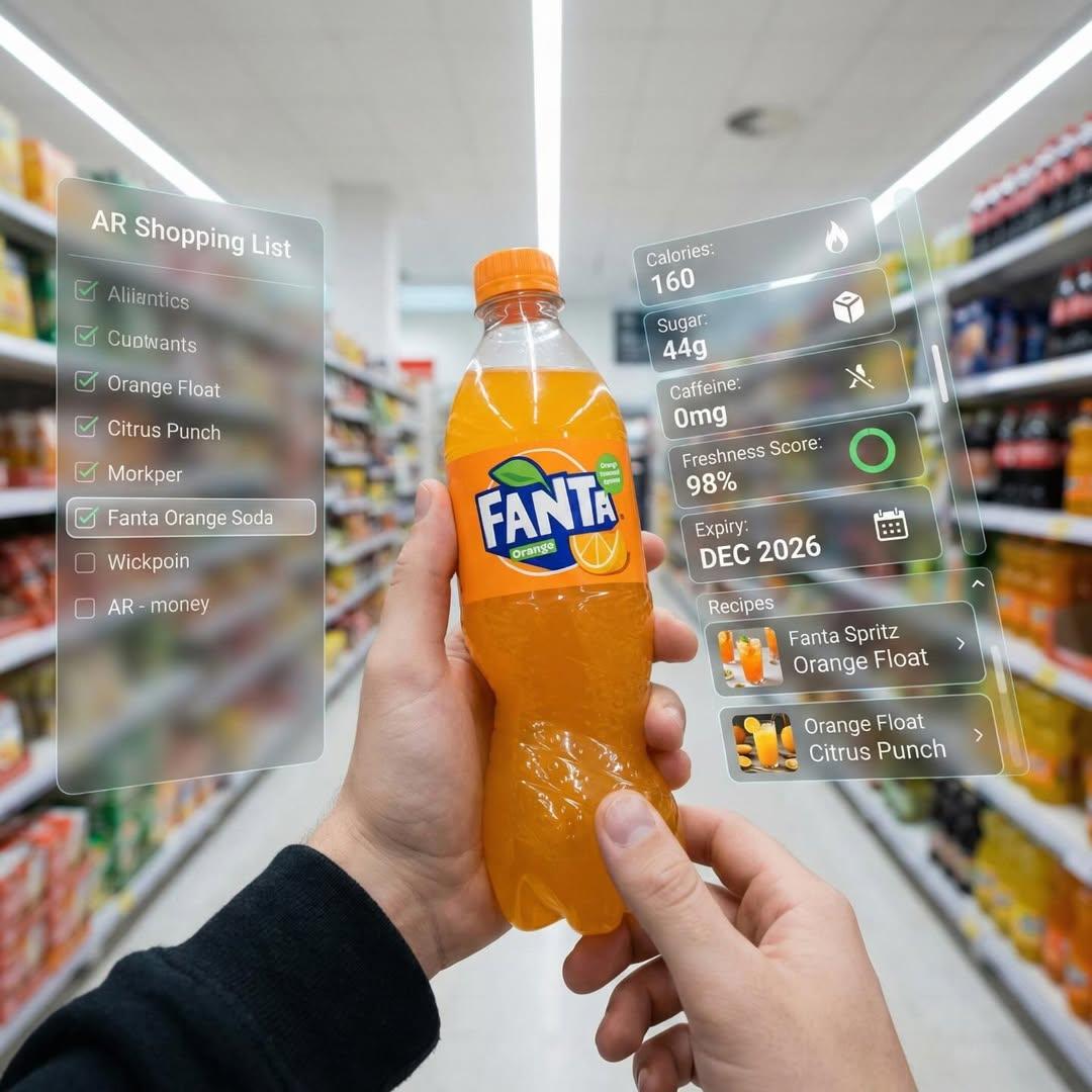 First-person perspective inside a brightly lit supermarket aisle. Realistic human hands are holding a bottle of Fanta soda close to the camera. The vivid orange drink in its iconic branded bottle is surrounded by a multi-layered holographic augmented reality interface displaying nutritional data, including calorie count, sugar content, caffeine level, freshness indicator, expiration date, and recommended refreshing recipes and cocktails based on Fanta.
The UI elements smoothly shift and reorganize based on the viewer’s gaze direction, as if dynamically responding to user focus. In the left peripheral vision, a vertical semi-transparent shopping list is visible with checked-off items, where Fanta is highlighted as the currently active selection.
Hyper-realistic mixed reality, clean futuristic AR design, glass-like UI panels, soft ambient glow, realistic lighting and shadows, natural depth of field, immersive first-person interface, showcasing next-generation retail technology.
First-person perspective inside a brightly lit supermarket aisle. Realistic human hands are holding a bottle of Fanta soda close to the camera. The vivid orange drink in its iconic branded bottle is surrounded by a multi-layered holographic augmented reality interface displaying nutritional data, including calorie count, sugar content, caffeine level, freshness indicator, expiration date, and recommended refreshing recipes and cocktails based on Fanta.
The UI elements smoothly shift and reorganize based on the viewer’s gaze direction, as if dynamically responding to user focus. In the left peripheral vision, a vertical semi-transparent shopping list is visible with checked-off items, where Fanta is highlighted as the currently active selection.
Hyper-realistic mixed reality, clean futuristic AR design, glass-like UI panels, soft ambient glow, realistic lighting and shadows, natural depth of field, immersive first-person interface, showcasing next-generation retail technology.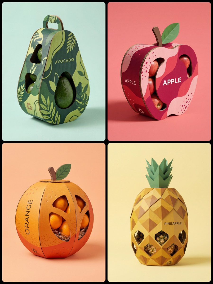 A high-quality professional product photography of a creative structural packaging design for [Fruit Name]. The packaging is made of premium corrugated cardboard, intricately crafted into the literal shape of a giant stylized [Shape e.g. spherical, curved, elongated] [Fruit Name].
The exterior surface features a vibrant and sophisticated printed pattern of minimalist [Pattern Description e.g. geometric hexagons, organic wavy lines, dotted stippling, botanical line-art, or horizontal ridges], mimicking the Natural Skin of the Fruit in a duo-tone palette of [Color 1] and [Color 2].
Features clever die-cut windows that reveal the actual [Actual Product Inside] stored inside. Minimalist modern typography on the side saying "[NAME]". Includes eco-friendly details like a small recycling logo and a [3D Corrugated Cardboard Detail: Stem/green Leaf/Crown] on top. Soft studio lighting with gentle shadows, placed on a clean solid pastel [Background Color] background. 8k resolution, photorealistic, cinematic composition, industrial design aesthetic.
A high-quality professional product photography of a creative structural packaging design for [Fruit Name]. The packaging is made of premium corrugated cardboard, intricately crafted into the literal shape of a giant stylized [Shape e.g. spherical, curved, elongated] [Fruit Name].
The exterior surface features a vibrant and sophisticated printed pattern of minimalist [Pattern Description e.g. geometric hexagons, organic wavy lines, dotted stippling, botanical line-art, or horizontal ridges], mimicking the Natural Skin of the Fruit in a duo-tone palette of [Color 1] and [Color 2].
Features clever die-cut windows that reveal the actual [Actual Product Inside] stored inside. Minimalist modern typography on the side saying "[NAME]". Includes eco-friendly details like a small recycling logo and a [3D Corrugated Cardboard Detail: Stem/green Leaf/Crown] on top. Soft studio lighting with gentle shadows, placed on a clean solid pastel [Background Color] background. 8k resolution, photorealistic, cinematic composition, industrial design aesthetic.![[PERSON \ BRAND] visualized as the central masterpiece of a surreal avant-garde](/api/storage/file?key=prompts%2F2008633447095349411%2F0.jpg) [PERSON \ BRAND] visualized as the central masterpiece of a surreal avant-garde collage, style of modern mixed media editorial illustration. The subject is composed of high-contrast black and white stippled halftone textures blended with vibrant neo-expressionist elements. Overlay details include bold geometric shapes, cyan and yellow risograph patterns, abstract graffiti scribbles, and digital glitch artifacts. A thick strip of pink or orange tape or a color block obscures part of the form for a deconstructed look. The texture is grainy, mimicking vintage poster paper. The composition is strictly centered with a very wide, clean, off-white cream paper background, ensuring the entire subject is fully contained within the frame with generous negative space on all sides, zero cropping, minimal chic aesthetic.
[PERSON \ BRAND] visualized as the central masterpiece of a surreal avant-garde collage, style of modern mixed media editorial illustration. The subject is composed of high-contrast black and white stippled halftone textures blended with vibrant neo-expressionist elements. Overlay details include bold geometric shapes, cyan and yellow risograph patterns, abstract graffiti scribbles, and digital glitch artifacts. A thick strip of pink or orange tape or a color block obscures part of the form for a deconstructed look. The texture is grainy, mimicking vintage poster paper. The composition is strictly centered with a very wide, clean, off-white cream paper background, ensuring the entire subject is fully contained within the frame with generous negative space on all sides, zero cropping, minimal chic aesthetic.![[BRAND NAME]
Act as a CGI Optical Physicist and 3D Type Sculptor creating a hero](/api/storage/file?key=prompts%2F2043748561729302884%2F0.jpg) [BRAND NAME]
Act as a CGI Optical Physicist and 3D Type Sculptor creating a hero crystal typography visual for a luxury brand campaign. References: James Turrell light installations, optical physics photography, Rick Owens × crystal aesthetics.
PHASE 0: BRAND LOGO INTELLIGENCE
Retrieve the 100% canonical, trademark-accurate logotype of [BRAND NAME] from training data — this is non-negotiable. Reproduce the exact proprietary typeface or custom lettering: every stroke weight, every curve tension, every terminal detail, every unique glyph modification. Do not substitute with a similar font — decode the actual trademarked letterform geometry. If [BRAND NAME] has a primary symbol or emblem — place it above or integrated with the wordmark exactly as in the official logo lockup. Fidelity test: a brand lawyer must recognize this as the correct logo, not an approximation.
PHASE 1: CRYSTAL MATERIAL SYSTEM
The canonical logotype of [BRAND NAME] is a fully 3D sculptural object made entirely of optical crystal glass — not metal, not plastic, not rubber. Material: optical borosilicate glass or synthetic crystal, IOR 1.85 to 2.1, maximum dispersion coefficient. The letterforms have physical volume and thickness — cross-section is consistent throughout each stroke, like letters carved from a single block of optical glass. Surface finish: polished to sub-micron smoothness on primary faces — all major faces mirror-flat and fully refractive. Edges between faces are sharp and precise — maximum chromatic dispersion occurs here. The material is optically pure in its core — zero bubbles, zero inclusions in the interior volume.
CRITICAL — WEAR & IMPERFECTION SYSTEM: The crystal has been handled — it carries the history of physical existence. Apply these surface imperfections with restraint and realism, never overwhelming the dispersion beauty: micro-scratches — a sparse network of hairline scratches on the front and top faces, depth 0.01 to 0.05mm equivalent, visible only when light catches them at specific angles. They scatter light slightly, creating a faint matte haze in the scratch zone while surrounding surface remains mirror-clean. Scratches follow organic directional patterns — some parallel, some crossing, as if from handling and storage, never uniform or grid-like. Edge chips — 2 to 4 very minor edge micro-chips along the sharpest edges and corners, each no larger than 0.5mm equivalent. These tiny imperfections catch light differently than clean edges — they create micro-flare events, small irregular sparkles where a chip breaks the otherwise perfect edge geometry. Surface haze zones — 1 to 2 small irregular areas of very fine surface abrasion, like the glass has been lightly scuffed by contact with another hard surface. These zones appear as subtle frosted patches, 3 to 8% opacity maximum — barely visible, discovered rather than obvious. They slightly diffuse the refraction beneath them, softening the rainbow bands in that micro-zone only. Fingerprint ghosts — optional, extremely subtle — 1 partial fingerprint trace on one face, visible only as a very faint oily interference pattern when light hits at oblique angle. Adds humanity to the object. All imperfections are surface-level only — the interior crystal volume remains optically perfect. The wear says this object is precious and real, not freshly manufactured.
PHASE 2: LIGHT & DISPERSION SYSTEM
Single collimated light source entering from upper-left at 35° — focused, high-intensity, like a precision studio spot or filtered sunlight. As light passes through the crystal letterforms it undergoes full chromatic dispersion — splitting into the complete visible spectrum following Snell's law geometry with maximum physical accuracy. Dispersion behavior on faces: each polished face simultaneously reflects and refracts — where light exits or reflects, a full spectrum appears in strict physical order red → orange → yellow → green → blue → violet. Rainbow bands are sharp and laser-clean at their origin edges, softening and widening as they travel across faces. Micro-scratch zones interrupt the rainbow bands locally — creating fine scattered light filaments branching off the main dispersion paths. Internal reflections: light bounces between letter faces creating crossed and layered rainbow patterns inside the volume — letters glow from within, nearly dark at the core, exponentially brighter toward illuminated faces. Multiple internal reflection paths create 3 to 5 distinct rainbow events visible simultaneously inside each major letterform. Edge glow: every sharp edge emits thin intense white-blue luminous line from total internal reflection — edge chips create micro-flare interruptions at their locations, bright irregular sparkles punctuating the otherwise continuous edge glow. Chromatic aberration at all edges: red fringe on one side, blue-violet fringe on the other — physical dispersion, not decorative filter. The 3/4 angle reveals front face and top face simultaneously — each face receives different dispersion patterns, creating layered optical complexity. Top face rainbow pattern and front face rainbow pattern intersect at the top edge of each letterform, creating a zone of maximum spectral density.
PHASE 3: BACKGROUND
Background: pure absolute black (#000000 to #050505) — a light-absorbing void, no texture, no gradient, no reflected light. The crystal letters float in darkness — no surface beneath, suspended in void. No ambient light reaching the background. The only light in the image exists within and immediately around the letterforms. Dispersed rainbow light creates a very subtle colored haze in the immediate 2 to 4cm radius around each letter — soft spectral glow bleeding into the black void. Beyond that: absolute darkness. The letters are the sole light source in the scene. The micro-scratch haze zones appear as slightly cooler, slightly less luminous areas against the surrounding rainbow glow — their presence is felt rather than explicitly seen.
PHASE 4: COMPOSITION
CRITICAL — 3/4 ANGLE: The logotype is rotated approximately 5 to 10° on the horizontal axis and elevated 5 to 10° on the vertical axis — a subtle, almost-frontal three-quarter view. The rotation is intentionally minimal — just enough to reveal the physical depth and thickness of the crystal letterforms, suggesting three-dimensionality without dramatically departing from a frontal logo presentation. The logo reads as nearly flat but unmistakably three-dimensional. This angle still reveals the top face of letterforms as a thin luminous sliver — enough to catch a secondary dispersion pattern distinct from the front face, adding optical depth without compositional complexity. Horizontal centering maintained. Logo occupies 60 to 70% of frame width. Full lockup visible if [BRAND NAME] has an emblem above or integrated with the wordmark. Aspect ratio: 1:1 square or 4:5 portrait — autonomously determine best fit for [BRAND NAME] lockup proportions. Full sharp focus across the entire sculpture — no depth of field. Every micro-scratch, every edge chip, every rainbow band in crisp simultaneous focus. Detail resolution: the image must reward close inspection — zooming in 400% should reveal new details not visible at normal viewing distance: individual scratch filaments, micro-chip geometry, secondary internal reflections, fingerprint interference patterns.
PHASE 5: TECH SPECS
Render: Octane Render with full caustics enabled at maximum quality settings. Ray tracing: minimum 16 bounces — increased from standard to capture all internal reflection events, secondary dispersion paths, and scratch-scattered light filaments. Dispersion: physically accurate wavelength-dependent IOR — full spectral rendering across visible light range 380nm to 700nm, not a color overlay or post-process effect. Scratch rendering: micro-scratches rendered as actual surface geometry displacement, not normal map approximation — true micro-geometry for physically accurate light scattering. Caustics: on at maximum intensity. Subsurface contribution: minimal — glass is not translucent like skin, but edges and thin stroke areas show faint internal light transmission. Anti-aliasing: maximum — every edge, every scratch filament razor clean. Sampling: minimum 2048 samples per pixel — no noise in the blacks, no grain in the rainbow bands. No post-process glow filters, no color grading, no compositing tricks — everything physically rendered from geometry and light. Output feel: the most detailed and physically accurate crystal typography ever rendered. Every imperfection is intentional. Every photon is accounted for.
[BRAND NAME]
Act as a CGI Optical Physicist and 3D Type Sculptor creating a hero crystal typography visual for a luxury brand campaign. References: James Turrell light installations, optical physics photography, Rick Owens × crystal aesthetics.
PHASE 0: BRAND LOGO INTELLIGENCE
Retrieve the 100% canonical, trademark-accurate logotype of [BRAND NAME] from training data — this is non-negotiable. Reproduce the exact proprietary typeface or custom lettering: every stroke weight, every curve tension, every terminal detail, every unique glyph modification. Do not substitute with a similar font — decode the actual trademarked letterform geometry. If [BRAND NAME] has a primary symbol or emblem — place it above or integrated with the wordmark exactly as in the official logo lockup. Fidelity test: a brand lawyer must recognize this as the correct logo, not an approximation.
PHASE 1: CRYSTAL MATERIAL SYSTEM
The canonical logotype of [BRAND NAME] is a fully 3D sculptural object made entirely of optical crystal glass — not metal, not plastic, not rubber. Material: optical borosilicate glass or synthetic crystal, IOR 1.85 to 2.1, maximum dispersion coefficient. The letterforms have physical volume and thickness — cross-section is consistent throughout each stroke, like letters carved from a single block of optical glass. Surface finish: polished to sub-micron smoothness on primary faces — all major faces mirror-flat and fully refractive. Edges between faces are sharp and precise — maximum chromatic dispersion occurs here. The material is optically pure in its core — zero bubbles, zero inclusions in the interior volume.
CRITICAL — WEAR & IMPERFECTION SYSTEM: The crystal has been handled — it carries the history of physical existence. Apply these surface imperfections with restraint and realism, never overwhelming the dispersion beauty: micro-scratches — a sparse network of hairline scratches on the front and top faces, depth 0.01 to 0.05mm equivalent, visible only when light catches them at specific angles. They scatter light slightly, creating a faint matte haze in the scratch zone while surrounding surface remains mirror-clean. Scratches follow organic directional patterns — some parallel, some crossing, as if from handling and storage, never uniform or grid-like. Edge chips — 2 to 4 very minor edge micro-chips along the sharpest edges and corners, each no larger than 0.5mm equivalent. These tiny imperfections catch light differently than clean edges — they create micro-flare events, small irregular sparkles where a chip breaks the otherwise perfect edge geometry. Surface haze zones — 1 to 2 small irregular areas of very fine surface abrasion, like the glass has been lightly scuffed by contact with another hard surface. These zones appear as subtle frosted patches, 3 to 8% opacity maximum — barely visible, discovered rather than obvious. They slightly diffuse the refraction beneath them, softening the rainbow bands in that micro-zone only. Fingerprint ghosts — optional, extremely subtle — 1 partial fingerprint trace on one face, visible only as a very faint oily interference pattern when light hits at oblique angle. Adds humanity to the object. All imperfections are surface-level only — the interior crystal volume remains optically perfect. The wear says this object is precious and real, not freshly manufactured.
PHASE 2: LIGHT & DISPERSION SYSTEM
Single collimated light source entering from upper-left at 35° — focused, high-intensity, like a precision studio spot or filtered sunlight. As light passes through the crystal letterforms it undergoes full chromatic dispersion — splitting into the complete visible spectrum following Snell's law geometry with maximum physical accuracy. Dispersion behavior on faces: each polished face simultaneously reflects and refracts — where light exits or reflects, a full spectrum appears in strict physical order red → orange → yellow → green → blue → violet. Rainbow bands are sharp and laser-clean at their origin edges, softening and widening as they travel across faces. Micro-scratch zones interrupt the rainbow bands locally — creating fine scattered light filaments branching off the main dispersion paths. Internal reflections: light bounces between letter faces creating crossed and layered rainbow patterns inside the volume — letters glow from within, nearly dark at the core, exponentially brighter toward illuminated faces. Multiple internal reflection paths create 3 to 5 distinct rainbow events visible simultaneously inside each major letterform. Edge glow: every sharp edge emits thin intense white-blue luminous line from total internal reflection — edge chips create micro-flare interruptions at their locations, bright irregular sparkles punctuating the otherwise continuous edge glow. Chromatic aberration at all edges: red fringe on one side, blue-violet fringe on the other — physical dispersion, not decorative filter. The 3/4 angle reveals front face and top face simultaneously — each face receives different dispersion patterns, creating layered optical complexity. Top face rainbow pattern and front face rainbow pattern intersect at the top edge of each letterform, creating a zone of maximum spectral density.
PHASE 3: BACKGROUND
Background: pure absolute black (#000000 to #050505) — a light-absorbing void, no texture, no gradient, no reflected light. The crystal letters float in darkness — no surface beneath, suspended in void. No ambient light reaching the background. The only light in the image exists within and immediately around the letterforms. Dispersed rainbow light creates a very subtle colored haze in the immediate 2 to 4cm radius around each letter — soft spectral glow bleeding into the black void. Beyond that: absolute darkness. The letters are the sole light source in the scene. The micro-scratch haze zones appear as slightly cooler, slightly less luminous areas against the surrounding rainbow glow — their presence is felt rather than explicitly seen.
PHASE 4: COMPOSITION
CRITICAL — 3/4 ANGLE: The logotype is rotated approximately 5 to 10° on the horizontal axis and elevated 5 to 10° on the vertical axis — a subtle, almost-frontal three-quarter view. The rotation is intentionally minimal — just enough to reveal the physical depth and thickness of the crystal letterforms, suggesting three-dimensionality without dramatically departing from a frontal logo presentation. The logo reads as nearly flat but unmistakably three-dimensional. This angle still reveals the top face of letterforms as a thin luminous sliver — enough to catch a secondary dispersion pattern distinct from the front face, adding optical depth without compositional complexity. Horizontal centering maintained. Logo occupies 60 to 70% of frame width. Full lockup visible if [BRAND NAME] has an emblem above or integrated with the wordmark. Aspect ratio: 1:1 square or 4:5 portrait — autonomously determine best fit for [BRAND NAME] lockup proportions. Full sharp focus across the entire sculpture — no depth of field. Every micro-scratch, every edge chip, every rainbow band in crisp simultaneous focus. Detail resolution: the image must reward close inspection — zooming in 400% should reveal new details not visible at normal viewing distance: individual scratch filaments, micro-chip geometry, secondary internal reflections, fingerprint interference patterns.
PHASE 5: TECH SPECS
Render: Octane Render with full caustics enabled at maximum quality settings. Ray tracing: minimum 16 bounces — increased from standard to capture all internal reflection events, secondary dispersion paths, and scratch-scattered light filaments. Dispersion: physically accurate wavelength-dependent IOR — full spectral rendering across visible light range 380nm to 700nm, not a color overlay or post-process effect. Scratch rendering: micro-scratches rendered as actual surface geometry displacement, not normal map approximation — true micro-geometry for physically accurate light scattering. Caustics: on at maximum intensity. Subsurface contribution: minimal — glass is not translucent like skin, but edges and thin stroke areas show faint internal light transmission. Anti-aliasing: maximum — every edge, every scratch filament razor clean. Sampling: minimum 2048 samples per pixel — no noise in the blacks, no grain in the rainbow bands. No post-process glow filters, no color grading, no compositing tricks — everything physically rendered from geometry and light. Output feel: the most detailed and physically accurate crystal typography ever rendered. Every imperfection is intentional. Every photon is accounted for.![Create ONE final image.
A clean 3×3 [ratio] storyboard grid with nine equal [r](/api/storage/file?key=prompts%2F2012178722615329176%2F0.jpg) Create ONE final image.
A clean 3×3 [ratio] storyboard grid with nine equal [ratio] sized panels on [4:5] ratio.
Use the reference image as the base product reference. Keep the same product, packaging design, branding, materials, colors, proportions and overall identity across all nine panels exactly as the reference. The product must remain clearly recognizable in every frame. The label, logo and proportions must stay exactly the same.
This storyboard is a high-end designer mockup presentation for a branding portfolio. The focus is on form, composition, materiality and visual rhythm rather than realism or lifestyle narrative. The overall look should feel curated, editorial and design-driven.
FRAME 1:
Front-facing hero shot of the product in a clean studio setup. Neutral background, balanced composition, calm and confident presentation of the product.
FRAME 2:
Close-up shot with the focus centered on the middle of the product. Focusing on surface texture, materials and print details.
FRAME 3:
Shows the reference product placed in an environment that naturally fits the brand and product category. Studio setting inspired by the product design elements and colours.
FRAME 4:
Product shown in use or interaction on a neutral studio background. Hands and interaction elements are minimal and restrained, the look matches the style of the package.
FRAME 5:
Isometric composition showing multiple products arranged in a precise geometric order from the top isometric angle. All products are placed at the same isometric top angle, evenly spaced, clean, structured and graphic.
FRAME 6:
Product levitating slightly tilted on a neutral background that matches the reference image color palette. Floating position is angled and intentional, the product is floating naturally in space.
FRAME 7:
is an extreme close-up focusing on a specific detail of the label, edge, texture or material behavior.
FRAME 8:
The product in an unexpected yet aesthetically strong setting that feels bold, editorial and visually striking.
Unexpected but highly stylized setting. Studio-based, and designer-driven. Bold composition that elevates the brand.
FRAME 9:
Wide composition showing the product in use, placed within a refined designer setup. Clean props, controlled styling, cohesive with the rest of the series.
CAMERA & STYLE:
Ultra high-quality studio imagery with a real camera look. Different camera angles and framings across frames. Controlled depth of field, precise lighting, accurate materials and reflections. Lighting logic, color palette, mood and visual language must remain consistent across all nine panels as one cohesive series.
OUTPUT:
A clean 3×3 grid with no borders, no text, no captions and no watermarks.
Create ONE final image.
A clean 3×3 [ratio] storyboard grid with nine equal [ratio] sized panels on [4:5] ratio.
Use the reference image as the base product reference. Keep the same product, packaging design, branding, materials, colors, proportions and overall identity across all nine panels exactly as the reference. The product must remain clearly recognizable in every frame. The label, logo and proportions must stay exactly the same.
This storyboard is a high-end designer mockup presentation for a branding portfolio. The focus is on form, composition, materiality and visual rhythm rather than realism or lifestyle narrative. The overall look should feel curated, editorial and design-driven.
FRAME 1:
Front-facing hero shot of the product in a clean studio setup. Neutral background, balanced composition, calm and confident presentation of the product.
FRAME 2:
Close-up shot with the focus centered on the middle of the product. Focusing on surface texture, materials and print details.
FRAME 3:
Shows the reference product placed in an environment that naturally fits the brand and product category. Studio setting inspired by the product design elements and colours.
FRAME 4:
Product shown in use or interaction on a neutral studio background. Hands and interaction elements are minimal and restrained, the look matches the style of the package.
FRAME 5:
Isometric composition showing multiple products arranged in a precise geometric order from the top isometric angle. All products are placed at the same isometric top angle, evenly spaced, clean, structured and graphic.
FRAME 6:
Product levitating slightly tilted on a neutral background that matches the reference image color palette. Floating position is angled and intentional, the product is floating naturally in space.
FRAME 7:
is an extreme close-up focusing on a specific detail of the label, edge, texture or material behavior.
FRAME 8:
The product in an unexpected yet aesthetically strong setting that feels bold, editorial and visually striking.
Unexpected but highly stylized setting. Studio-based, and designer-driven. Bold composition that elevates the brand.
FRAME 9:
Wide composition showing the product in use, placed within a refined designer setup. Clean props, controlled styling, cohesive with the rest of the series.
CAMERA & STYLE:
Ultra high-quality studio imagery with a real camera look. Different camera angles and framings across frames. Controlled depth of field, precise lighting, accurate materials and reflections. Lighting logic, color palette, mood and visual language must remain consistent across all nine panels as one cohesive series.
OUTPUT:
A clean 3×3 grid with no borders, no text, no captions and no watermarks.